Combining Content Design with Component-Based Approaches
A well-crafted content strategy is important for driving engagement and delivering a seamless user experience. But how do you ensure that your content resonates with users and is easy to manage? The answer lies in combining thoughtful content design with component-based structuring. Let’s explore how this approach can improve your content strategy and help you create a more effective website.
While this article focuses on using Convivial CXP and GovCMS, the insights shared are valuable for any website editor or owner looking to improve their content strategy and design approach.
Content Design
Content design goes beyond just writing; it's about structuring information in a user-goal-oriented way. The aim is to ensure that content is clear, concise, and designed for consumption.
Good content design requires knowing your audience. Are you speaking to experts in your field or first-time visitors? Their needs will determine how you structure your content, the tone of voice, and the length of your pages. A well-thought-out design ensures that users get what they need without being overwhelmed.
Components for your landing pages
Now that you’ve set the foundation with good content design, it’s time to consider the best components for delivering that content. Components are the building blocks of a website, designed to be reusable and flexible. They help maintain consistency and usability to make it easier to manage content.
Here are some components that work exceptionally well for campaign/landing pages:
Component: Section
Sections are layout-focused components that enable site editors to build content creatively without needing to code. Users can add components within a section and easily define the layout, making it a flexible tool for dynamic page creation.

Component: Node/Item lists
Node and item lists are perfect for displaying concise information on your website. They offer flexibility in how you structure and present content, with the option to change the view mode for different visual outcomes.

Component: Fast facts
Fast Facts are designed to make statistics stand out. These styled components elevate the hierarchy of your data with the ability to add prefixes and suffixes. They are also animated, drawing users' attention as they scroll through the page, making statistics more engaging and impactful.

View mode: Image cards
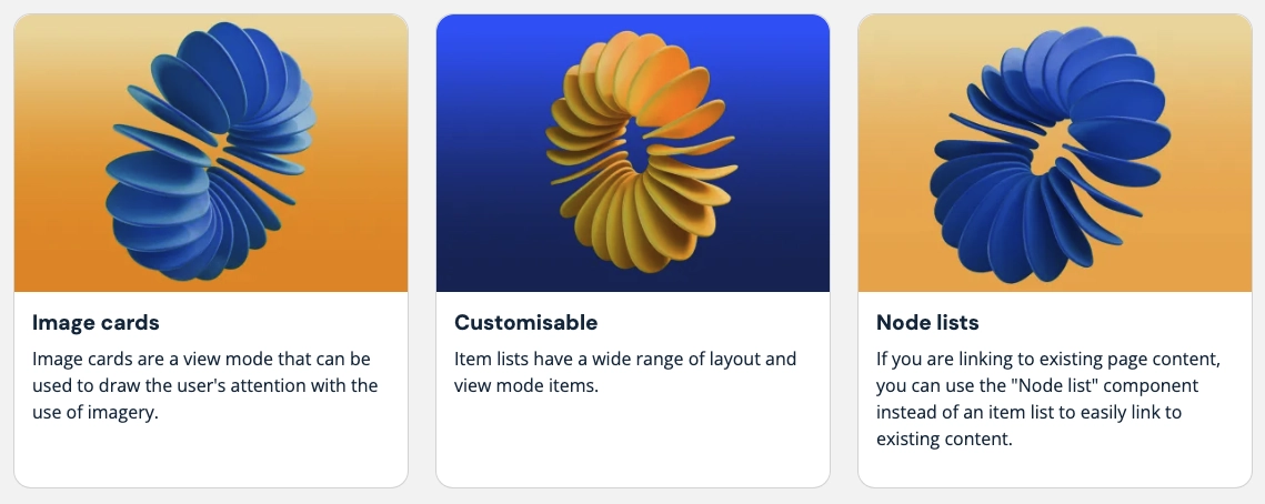
Image cards are ideal for presenting brief snippets of information alongside compelling visuals like thumbnail images. Whether highlighting blog posts, services, or case studies, cards create an engaging layout that makes content easier to scan.
View mode: Icon
When photos or images aren't suitable, icon cards provide a cleaner, more simplified way to present important content. Icons help draw attention to key areas, transforming what could otherwise be long blocks of text into more digestible information.
Modifiers – The presentational uplift
Modifiers can be added to your content, helping your pages stand out. Easily incorporate background images, colours, parallax effects, scroll reveals, and gradients to create visually engaging content.


