Some things come and go every year, website design trends are a big one. It’s important to note that design trends are relative, meaning the purpose of the website has a bigger impact on which trend is suitable for the project you’re designing.
In a world where Brutalist Minimalism is starting to dominate many design agency websites, we can’t always apply this stylistic choice to a government agency. For example, using this style on the Australian Taxation Office would be a bold choice (pun intended). That is not to say that certain design trends can't be applied to government websites or any other project but it's important to know your audience and what is important to them.
If you visit YouTube or your social platform of choice and search for the top trends of the year you typically will see some amazing web design. What’s usually missing in this content is context, it often highlights the big, loud, out-there design studios and not the everyday client websites we work on.
Designers need to find the perfect balance between form and function.
Here are some trends that are more grounded and broadly appropriate for most projects:
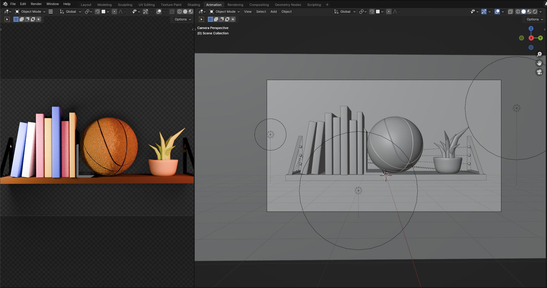
Component-driven design
Design systems and component-based design continue to dominate, especially with tools like Figma, Storybook making it easier to maintain scalable, consistent designs across projects.
A component is a modular piece of a user interface that is used for structure and behavior. Think of it like a lego brick, it serves a single purpose but can be reused and combined in different ways.
A design system is a unified language which maintains visual consistency across different pages/platforms. It contains a set of reusable components and patterns which combine to provide a framework used by designers and developers to design, develop & deliver a cohesive website/APP.
You can learn more about Designing your content strategy with components.
Motion
Micro-interactions and meaningful motion help build intuitive UIs. Think subtle transitions, animated button states, and scroll-triggered effects that guide users rather than just entertain.
A good example: scroll-triggered events on key content at the beginning/end of content regions.
There are various ways to introduce motion into your designs. Hover states, scroll events, parallax and animation are the main areas where you will find motion used regulary. It is important to note that you should not overdo it. Not everything needs to move and if it does, consider a subtle approach. Less can be more.
Accessibility awareness
Awareness around accessibility continues to grow, but there’s always room for improvement. At the start of a project, brand guidelines can present contrast challenges with colour palettes. Designers need to do what they do best: problem-solve. That might mean proposing alternative colour solutions that still respect the brand but meet accessibility standards. Often, guidelines are created without accessibility in mind or without a full understanding of WCAG requirements.
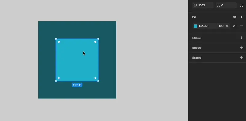
A recent Figma update is helping here. Previously, designers had to rely on plugins or external tools to check contrast and adjust colours. Now, Figma lets you select a layer and instantly check contrast ratios, with the ability to define scenarios for large text, normal text, and graphical elements.
The real magic of this update:
- Auto adjust: With the click of a button Figma will make a suggested colour change to meet an acceptable contrast ratio. So far most auto adjust results has returned a perfectly acceptable solution. This feature has proven to be a huge time saver!
- Visual representation: The colour picker now has a visual representation of the colour regions that will pass contrast ratio tests based on the background colours for layers found behind your selected layer.
3D elements
3D elements are emerging as a powerful design trend, offering depth, interactivity, and storytelling. When used thoughtfully 3d assets can be a powerful design lift to a project. These assets could be static 3D images, subtle parallax, animations, or immersive data visualizations which can help communicate complex ideas in more engaging ways.
Tools like Blender, Three.js, Spline, and Lottie help designers create lightweight, responsive 3D assets that bring clarity and emotional depth. Just use it with purpose and restraint.
Hand-drawn elements
A human touch stands out in an AI-saturated visual space. Hand-drawn illustrations can be clear, approachable, and personable. Perfect when stock images don’t cut it and you want to create something warm and expressive.
Illustration can capture an expression or a difficult topic that photography sometimes can't. A hand-drawn approach can also add a point of difference to your website, allowing for the user experience to be more unique to your project. An added bonus to custom work avoids the risk of using the same stock photography as another site.
Stock photography – a word of caution
In a recent project we discovered that several stock images purchased were AI-generated images. These images were not too noticeable until we got our hands on the high-resolution versions. This seems to be a new emerging trend and whilst it isn’t a website design trend, it is one to watch out for. In some circumstances, it may be perfectly fine to use such an image, however carefully consider the image's purpose in your designs and ensure you are making the right selection when it comes to stock photography.
In our recent experience, industry-specific equipment was clearly generated by AI. The high-resolution images revealed imperfections and an alien-like language used for text on the equipment (possibly Klingon). For obvious reasons, we made the decision to avoid using these images, preventing any damage to the client's brand.

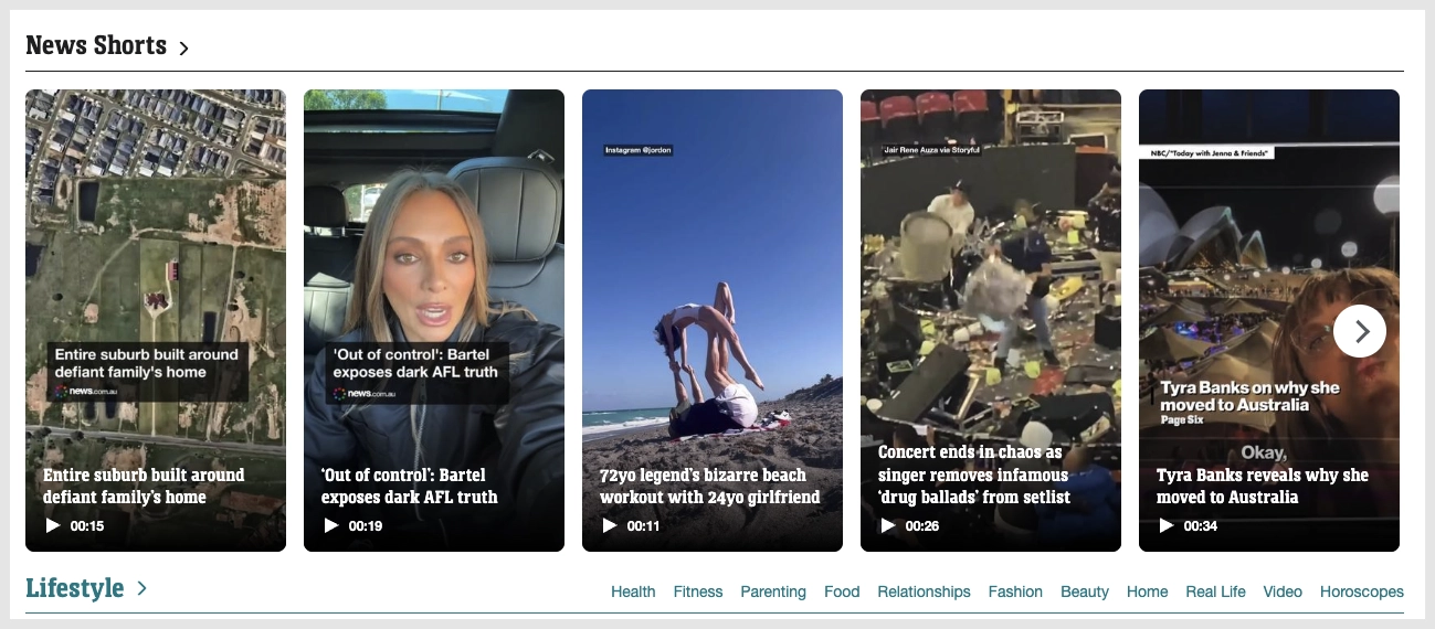
Vertical video – Shorts / Reels / TikToks
Almost every social media platform has embraced vertical video. The evidence is clear: mobile users prefer experiences that feel natural to how they hold their phone. This trend is showing up even on news sites like news.com.au. Consider this format when adding video galleries to your sites.
Conclusion
Design trends may change with the seasons, but good design is always rooted in purpose. While it’s tempting to chase the flashiest new styles showcased by top-tier agencies, the real challenge and the real art is in adapting trends to serve your audience, your brand, and your goals.
Trends should inspire not dictate. Take what serves the project, leave what doesn’t and always design with clarity, empathy, and usability in mind.