

Here is a breakdown of the new features, visual updates, and under-the-hood changes you'll see from the 2026Q3 release.
Custom icon support
We are excited to introduce custom icon support in the latest Convivial for GovCMS update! While our built-in icon sets cover a wide range of use cases, content editors now have the flexibility to upload their own bespoke SVG icons directly into the site's Media library.
This new feature allows teams to align their digital presence even closer to specific brand guidelines or campaign needs. Once uploaded and the site cache is cleared, editors can effortlessly apply their new graphics anywhere an icon field exists simply by using a custom. prefix followed by the file name.
A major focus of this update is ensuring seamless integration and accessibility. The custom icon architecture is built to be fully colour-palette aware. By following a few simple design preparations before uploading, such as using a standard 32x32px canvas, converting strokes to outlines, and setting the SVG fill to currentColor, your custom icons will automatically adapt to the site's theme and contrast requirements. This ensures that any new icon you add will be completely accessible and scale perfectly alongside the existing icons on your pages.

Footnotes
By using a simple inline bracket syntax, editors can seamlessly include citations or additional context without breaking their writing flow. The system automatically handles the formatting by inserting a clickable superscript number in the text and generating an organised footnotes list at the bottom of that specific section.
Readers can easily jump between the text and the reference using built-in navigation arrows. Furthermore, footnote numbering is scoped to individual components, meaning each new section automatically restarts its numbering to keep your page structured and your references perfectly organized.

Hero component
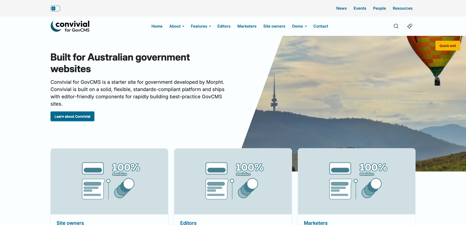
The Hero component lets you pair content with an image to create engaging page headers and calls to action. Its flexible content area supports multiple nested components, allowing editors to build complex layouts using Accordions, Charts, Embedded Blocks, Webforms, Stats, Node/Item Lists, and more.
We've added granular design controls to give you complete flexibility over the Hero's appearance. Editors can now fine-tune the layout by:
- Image Positioning: Selecting the image side (Start or End) and adjusting the proportional width (Half, Third, or Quarter).
- Shape Variants: Applying modern cutout shapes to the inner edge of the image, including slants, rounded corners, curves, arrows, and wavy edges.
- Alignment & Presentation: Controlling the vertical alignment (Top, Centre, or Bottom), alongside fully integrated presentation settings like Colour Palettes, Textures, Patterns, and accessibility-friendly overlays.
Patterns
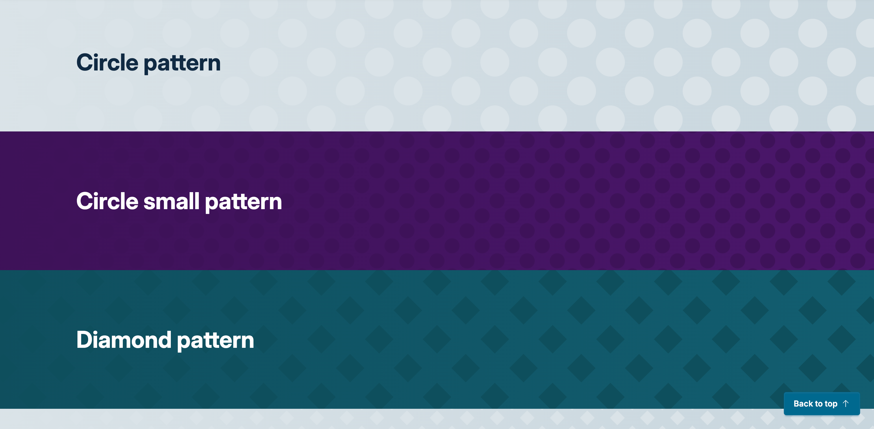
Say goodbye to rigid background designs. Convivial now features colour palette-aware, lightweight SVG pattern backgrounds. Patterns are defined as taxonomy terms, allowing site editors to dynamically expand their pattern library over time.
By treating patterns as taxonomy terms, site administrators have fine-grained control over how the pattern behaves. When uploading an SVG tile, editors can precisely specify the pattern's size (in REMs), its position (using a 9-point grid from Left-Top to Right-Bottom), and its repeat behaviour along both the X and Y axes (Space, Round, or No Repeat). This ensures patterns seamlessly adapt to any container size or viewport.
Font Management
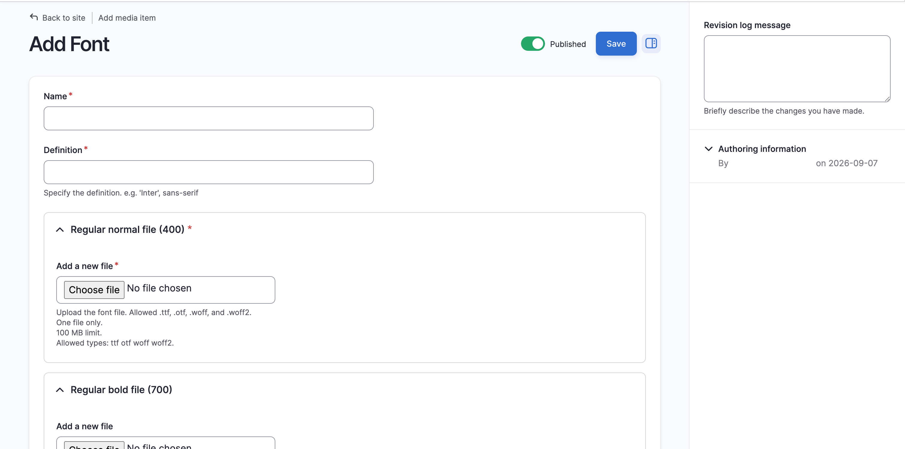
Typography is now easier and more secure. Fonts can now be uploaded directly as media entities natively within the CMS. This allows for improved privacy and performance by self-hosting files, no longer requiring the use of the Google Fonts CDN.
The new Font media type allows administrators to declare a font definition (e.g., "Inter" sans) and directly upload .ttf, .otf, .woff, and .woff2 files for specific font weights and styles. Dedicated fields are provided to map files precisely to Regular Normal (400), Regular Bold (700), Italic Normal (400), and Italic Bold (700), ensuring the browser delivers the exact typography required without third-party requests.
Translations
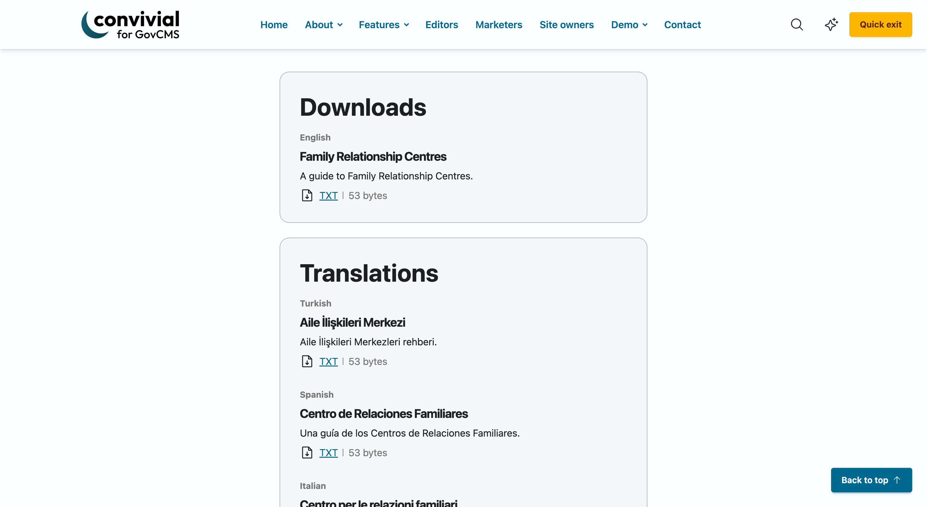
We’ve improved resources by introducing natively supported translated documents, complete with language-specific headings and summary text.
To power this, Convivial introduces a dedicated "Language" node type. Site builders can define custom languages with translated labels, specific BCP 47 language codes (like ar, yue, or zh-Hant) to assist screen readers, and a simple toggle to support Right-to-Left (RTL) text direction.
Translation Content Type (Documents)
We've introduced a simple listing page displaying all translated documents for a specific language. To keep content architecture clean, each document listed is linked back to the original source resource it was translated from.
Our new Document media architecture supports this by allowing editors to provide a localized "Translated name" and description (used for teasers and metadata). You can classify these documents by type (Download, Translation, or Easy Read) and upload a variety of accessible file formats, including .doc, .docx, .pdf, .txt, and .html. This creates a robust, highly searchable, and structured way to manage diverse multilingual resources.

A complete slider refactor
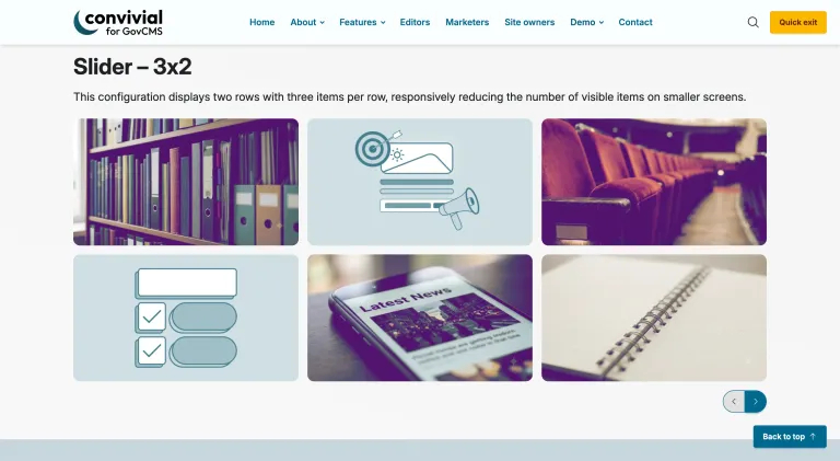
We've completely overhauled how users interact with and navigate sliders. To simplify the user experience, navigation controls (Next/Previous) are now anchored to the bottom-right corner of the slider component, while pagination sits neatly in the bottom-left.
The slider now has the ability to add a grid layout with the option to display multiple rows as well as columns.
To keep things clean on smaller screens, pagination is now hidden on mobile devices. We’ve also implemented better container queries, ensuring the slider's responsive behavior adapts beautifully across all screen widths with available view modes.
To top it off, the accessibility module is now enabled on the slider component, allowing Swiper to announce slide changes and properly label its own controls.
Richer page banners
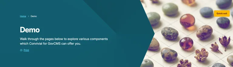
The banner region is one area that needs close attention as it performs multiple duties across simple pages (articles) and more demanding ones such as campaigns. The structure and functionality of the banner has been substantially uplifted, allowing for more presentational options and editor creative control.
- Animated page banners: Editors can now bring page banners to life with a full-width background image and an optional slow "pan & zoom" motion effect (featuring 36 presets like zoom in/out and various focal points). Note: Visitors with "reduce motion" enabled will see a static image to remain accessibility compliant.
- Banner side image: We've added new decorative edge shapes (slants, curves, waves, arrows, rounded corners).
- Banner utility buttons: Print and Listen buttons have been added directly to the banner region, giving users immediate control over how they want to share or consume page content.
Footer redesign
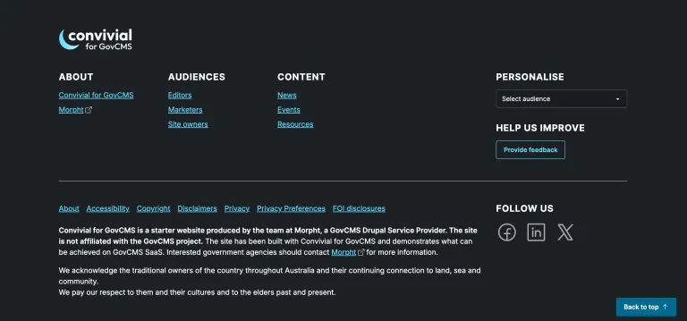
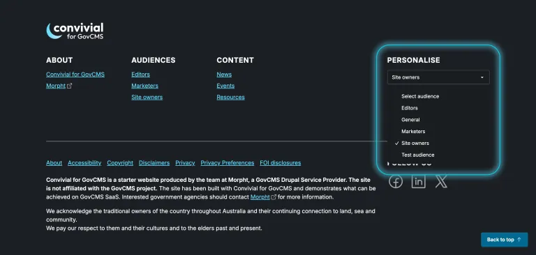
The footer region has been entirely redesigned. It now serves as a dedicated home for site logos, personalisation (audience) filtering, and a "Provide feedback" link. Overall the footer is not more functional and can comfortably handle standard requirements for government sites.
Related region
The page template has been updated to support a new, standardized "related" region for content.
Smarter video & media controls
The handling of media has also been uplifted.
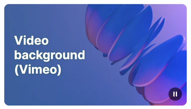
- Accessible video backgrounds: Video backgrounds now feature a visible pause/play button. If a visitor's browser requests reduced motion, the video will start paused and display a fallback image automatically.
- Clickable image comparisons: The image comparison slider is no longer restricted to drag-only interactions. A full-width range input allows the divider to respond to a single click, a tap, or keyboard arrow keys.
- Immediate logo updates: Logos are now rendered through Drupal's image field pipeline. This introduces automatic cache-busting, meaning when you replace a logo file, the site updates immediately rather than waiting for a browser cache to clear.
- Uncropped media defaults: Images in the default media display are no longer forced into a 16:9 crop; they now display uncropped at a medium responsive size.
Layout & component refinements
Many components have been reviewed and refined, bring extra polish to the overall look and feel.
- Card background colors: Card components now use a refined background at 90% opacity instead of using the background-stronger variable. This brings card backgrounds perfectly in line with the intended design palette while maintaining strong accessibility contrast.
- Content column gaps: We've increased the gaps between columns on content pages to better delineate main content from sidebar content.
- Call to action (CTA) redesign: CTAs have been redesigned to use an elegant 8-1-3 layout. This provides adequate breathing room for the main text (8 columns), a one-column gap, followed by the action button (3 columns).
- FOI Listings: Freedom of Information (FOI) listings have been upgraded. They now use a responsive Search view mode instead of a rigid table, and feature faceted search so users can easily filter results by date.
- Sidebar nav parent: Stronger navigation logic that now includes the parent link directly in the sidebar menu.
- TOC Smooth scrolling: Clicking links in the Table of Contents now features smooth scrolling behavior.
- New card date component: A new date card component has been introduced to display important dates and events. On narrow cards, the date displays as a full-width band above the text; on wider cards, it appears as a calendar tab beside the text, separated by a hairline border.
- Item list – Item: The item paragraph now includes a Date field across all eleven view modes (teaser, tile, summary, stack, icon, card, etc.).
- Enhanced file links: File links across the site (and via the Teaser Icon component) now consistently display a download icon, the file name as the link, followed by the file type and size. Basic pages also now show a "Download" heading above their attachments. We also pushed a small layout fix ensuring file "download" tiles no longer squash their icon or filename.
- Refined Teaser Icon: Teasers icons now feature a bold title followed by category and date, separated by a short divider (which only draws if a date exists to prevent empty gaps).
- Datatable component: A brand new component allowing CSVs to be uploaded and displayed as interactive tables.

Audience selection widget
Previous iterations of the site included a lightweight “Audience filter” that allowed content to be selectively shown based on the audience of the user. This is the easiest way to personalise the site. This capability has been extended with an Audience widget, giving the user visibility and control over their audience.
- Audience widget: Visitors can now explicitly choose their own audience via a dropdown block (often located in the footer), rather than relying solely on inferred browsing behavior. This choice is remembered in the browser, perfectly announced by screen readers, and ensures personalized content is highly accurate.
- Asynchronous audience filters: Choosing an audience in standard filter views now updates the page immediately without a reload. It raises a toast notification in the bottom right that clears after five seconds (unless hovered or focused) and announces the change to assistive technologies.
Accessibility (A11y)
Accessibility is a continuous journey, and Q3 brings major quality-of-life updates for all users, aiming to achieve WCAG2.2 AA standards:
- Semantic rich text rendering: Editor-authored rich text now consistently renders a much fuller set of standard HTML elements. Tags like <abbr> (hover to show full term), <dl>, <dt>, <dd>, <hgroup>, <cite>, <address>, <dfn>, <time>, along with citations, highlighted text, and collapsible "details" sections now display beautifully. This massively improves machine-readability for screen readers, search engines, and AI assistants.
- Combobox search suggestions: Search suggestions now act as an accessible combobox. Screen readers announce the suggestion list with a count and navigation hints, and individual suggestions are announced as they are highlighted.
- Zoom & short viewport support: On short viewports (like a phone held in landscape, or a browser zoomed to 400%), sticky elements like headers, footers, sidebars, and tables of contents are released to scroll with the page, ensuring users aren't left with zero reading space.
- Distinct navigation landmarks: Menu landmarks now have distinct accessible names. For example, the sidebar menu announces "In this section" rather than sharing "Main navigation" with the header.
Editor experience & under the hood
- No-code favicons: Site administrators can now upload and manage favicons entirely through the Drupal UI without writing code! By enabling the Metatag: Favicons submodules, you can configure 16x16, 32x32, SVG, and Apple touch icons directly from the Global Metatag settings.
- Clearer help text: We’ve reworded the editor help text across roughly two dozen fields (primarily tightening grammar) to make instructions clearer without changing how the fields behave.
Custom welcome message
As a friendly touch, the platform is convivial afterall, a customised welcome message is displayed to the user based on the time since they last logged in and what time of day it is. User profile pages now feature a dedicated intro block placed above the existing profile blocks.
Conclusion
Morpht is deeply committed to the continuous evolution of Convivial for GovCMS. This Q3 release reflects our ongoing dedication to providing a starter site that is not only highly flexible and empowering for content editors, but fundamentally accessible by design.
As we push our components to meet and exceed WCAG 2.2 AA standards, our goal remains the same: to give government agencies the most robust, inclusive, and user-friendly digital foundation possible.
We have invested significant time and expertise into this latest round of improvements, but we are always looking for ways to refine the platform further. We welcome your feedback on these new features and would love to discuss how Convivial for GovCMS can accelerate and elevate your next project.