If you're building a new website or considering updates to your current one, you've probably noticed that dark mode has become more than just a trendy design feature. What started as a sleek aesthetic choice has evolved into an important accessibility consideration that can significantly impact how people interact with your site. The addition of dark mode capabilities to a website is now an important consideration during the design phase of any website project.
What is dark mode?
Dark mode flips the traditional colour scheme by displaying light-colored text on a dark background instead of the usual dark text on white. It's designed to be gentler on the eyes, reducing light output from a device while keeping contrast ratios sharp enough to allow good readability.
While some people choose dark mode simply because they like how it looks, the benefits for those with visual impairments are also important and should be discussed as part of larger accessibility considerations.
Who benefits most from dark mode?
People with light sensitivity
One of the most significant accessibility benefits of dark mode is for users who experience photophobia or light sensitivity. This condition causes discomfort or pain when exposed to bright light, and it's more common than you might think. Light sensitivity frequently occurs alongside migraine headaches, with many migraine sufferers experiencing heightened sensitivity to light even between attacks.
Dark mode reduces bright light, making it easier to see in low-light situations, such as late at night or early in the morning. For users with photophobia, this reduction in screen brightness can make the difference between being able to use your website comfortably or avoiding it altogether.
Users with certain vision conditions
Dark modes have numerous benefits for certain users: If a screen has flicker problems, dark backgrounds can reduce flickering. This is particularly helpful for people whose vision conditions make them more susceptible to screen flicker effects.
Some users with specific visual impairments, including certain types of astigmatism and cataracts, find that dark mode significantly improves their ability to read and navigate websites. The reduced glare can make text clearer and easier to focus on.
Aesthetics
It is worth noting that many users like the dark mode aesthetic, and this might be reason enough to support it alongside the standard theme for a site. While accessibility should be a primary driver, user preference is valuable too.
Implementation consideration
There are some important things to consider when designing a dark mode. The implementation is not a simple matter of flicking a switch to make the theme dark.
Covering all the bases
Dark mode can actually create challenges for some users if not properly designed. These include low contrast levels for elements, which can make navigation difficult for users with certain vision conditions. The implementation, therefore, needs to consider all of the design elements and ensure that there is sufficient contrast. This includes:
- Colour palettes
- Logo images
- Icon colours
- Forms and buttons
- Tables
- All other components that make use of colour
Handling the above aspects requires careful consideration and configuration options to make dark mode possible. Solutions to the above problems can include:
- A separate set of colour palettes is defined for dark mode
- Alternate “light” images for logos to be displayed on the background
- SVG icons with “outlines” which can be filled with a colour
- Components to make use of colour scheme specific colour palettes for text, links and borders.
Give users control
The key to accessible dark mode implementation is choice. It is important not to force everyone into dark mode or assume it's universally better. The best way to handle this from a user experience point of view is to first respect the options configured by the user in their browser. This should be the default choice and put the user in control with no need for them to do anything. Secondly, providing a toggle between light and dark modes allows the user to make an explicit choice according to their preferences.
Adding dark mode to your website user needs will be better met. Beyond accessibility, dark mode can better accommodate user preferences. Dark mode can be thought of as part of a broader commitment to inclusive design.
Dark mode on government sites
Thus far, government websites have been slow to adopt dark mode as a theming option for users. There are only a few known examples of sites where it has been adopted. The reasons are probably down to wanting to take a conservative approach and to maintain standards. However, we have now begun to see some developments in the area, and we expect more sites to adopt dark mode in the future.
Services Australia: https://www.servicesaustralia.gov.au/
The Services Australia site now offers a Dark and Light mode of operation via a toggle in the top right-hand side of the page. The design choices on this site have been kept simple to allow for a clean implementation, only involving a few colours. Effort has been put into the imagery on the site, switching out to different colours for the icons. This is an impressive approach which has required attention from the designers.
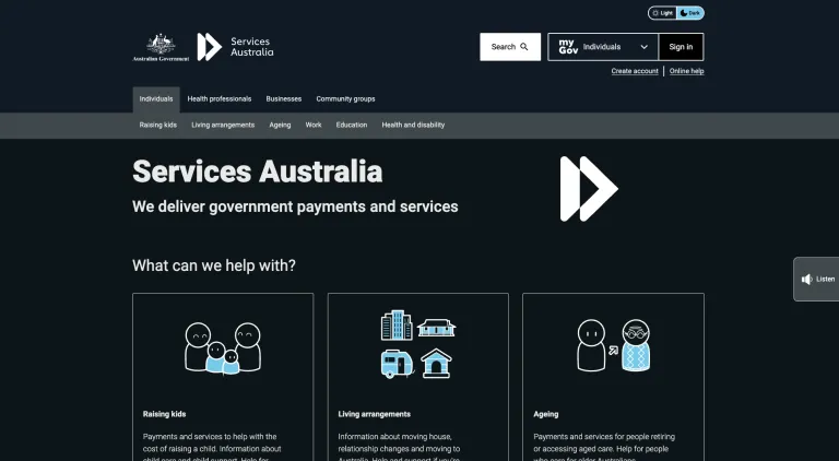
Following extensive research and testing, we’ve launched dark mode for our website. Dark mode changes the colour theme of this website from light to dark. Dark mode is often easier to read in low light conditions and can reduce eye strain and battery usage. Dark mode is becoming increasingly popular.
https://www.servicesaustralia.gov.au/dark-mode-services-australia-website?context=22
NSW Design System: https://designsystem.nsw.gov.au/core/colour/index.html
The NSW design system doesn’t offer a dark mode switch, as such. However, it has pushed the boundaries in terms of defining different palettes which can be used by sites using palettes. This approach has been made possible through the use of CSS variables and abstracting the concept of what makes up a colour palette. These ideas are core to how a dark mode can be effectively implemented in the future.
Dark mode is now in the Convivial starter site
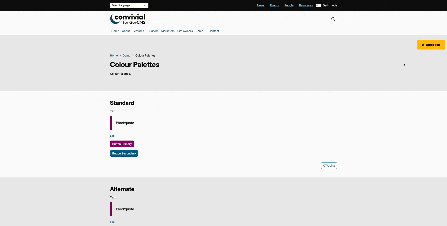
With the above accessibility and aesthetic improvements in mind, Morpht has included a dark mode switch as a standard part of the Convivial starter site. The innovation shown by Services Australia is something we believe will be adopted by more government agencies in the future.
You can see it in action in the top right-hand side of each page: https://govcms.convivial.io/
In designing this new feature, we have considered the following steps:
- Respect system preferences: The site initially checks the user's browser for a dark mode preference.
- Make it optional: Users can manually select light or dark modes depending on their preference. This is done by a small toggle switch at the top of the page.
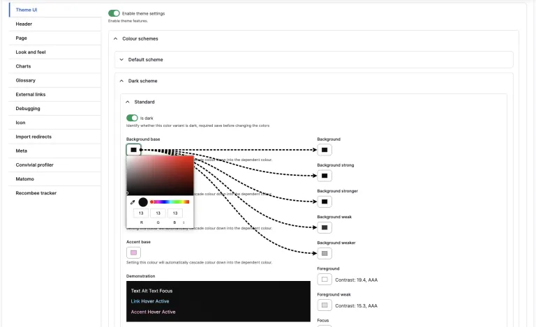
- Test contrast ratios: A new set of dak colour palettes has been defined. We have ensured that they provide sufficient contrast for accessibility standards.
- Check all elements: All elements in the theme are colour palette aware and make use of CSS variables to render out colours in a reliable way.
Final thoughts
Aesthetic appeal and improved accessibility are the strongest arguments for implementing dark mode. While it may require additional design and development time, the investment pays off in creating a more inclusive, user-friendly website that serves a broader audience. The recent updates to the Convivial starter site makes this process much easier with user interface configuration of the various colours.
Dark mode isn't just a passing trend. It's become an expectation for modern websites. We expect to see it deployed more frequently across sites in the future, including on government sites.. By thoughtfully implementing it, you're not only improving accessibility for users with specific needs but also enhancing the overall user experience for everyone who visits your site. This kind of inclusive thinking can set your website apart.
Authored by

Managing Director
Murray is a co-founder and the Managing Director at Morpht. He brings 25 years of development and consulting experience, working in the semantic web, knowledge management, personalisation and AI.