Theme
Refactor and CSS Variables
The theme structure has been refactored and cleaned up. CSS rule definitions are simpler and more consistent. They are now able to make use of a clearly defined set of CSS variables, which have unified the way the theme operates across components and layouts. Most importantly, the theme is not 100% colour palette aware, allowing colour palettes to be easily swapped in and out across all content types and components.
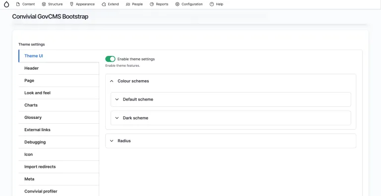
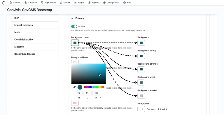
Colour UI
The improvements to colour management and CSS variables opened the way for user configuration of colour palettes in the UI. The UI has now been upgraded to better handle the core colours for each palette and the associated derivatives. Users can now define the base colours (text, background, link, accent) and a bunch of derivatives are calculated. Users are provided with helpful feedback on contrast accessibility and are provided a preview of the output. This innovative feature makes it much easier for a designer or sitebuilder to define the colours for a site in minutes by avoiding the need to drop down to the code level to define SASS variables.
Main menu options
Convivial for GovCMS has always supported several options for displaying the main menu. These options have been refined and tightened up so that they work more reliably. The supported options are now:
- Simple
- Dropdown – up to 3 levels
- Megamenu – up to 4 levels
- Megamenu (description first level) – up to 4 levels
- Megamenu (descriptions all levels) – up to 4 levels
As usual, our megamenu implementation relies on Adobe Accessible MegaMenu, which provides a good user experience, solid accessibility features, including keyboard accessibility.
Feedback form caching
GovCMS has recently announced that webforms generally should not be embedded into content. To project webforms, the cache needs to be disabled, and this will diminish the scalability of the site if webforms are used widely. We have therefore implemented the “Was this page useful” feature using a call-to-action button, rather than a form. This will ensure that Convivial for GovCMS sites do not suffer degradation.

Colour
Updated palettes
Convivial for GovCMS has always supported colour palettes which can be editor-selected for components on the site. We originally inherited the palettes as defined by the Australian Government Design System (AuDS): standard, alt, dark and dark alt. We have finally moved away from this convention and have settled on a set of colour palettes that are flexible enough for most projects.
- Standard
- Alternate
- Primary
- Secondary
- Tertiary
- Light
- Dark
The first five palettes do not commit to being dark or light. They can be either. This makes it possible to build out dark themes easily. There is no requirement for “Standard” to have a light background.
The Light and Dark palettes have been created for situations where contrast counts. For example, a dark background image may have been selected. For this situation, the Dark palette can be used to ensure correct contrast with the image.
Colour palette swap modifier
If you have the palettes, why not show them off? We created a new “colour palette swap” modifier, which can be attached to components. The modifier will transition between palettes based on the scroll position of the container it has been applied to. This effect can be used effectively on marketing sites where attention needs to be drawn to a particular section on the page.
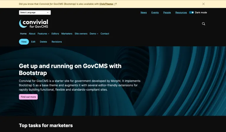
Dark mode
We see dark mode being used more frequently across the web for both aesthetic and accessibility reasons. The extra flexibility afforded by the CSS variables and the management of colour palettes made the addition of a dark mode straightforward. Users can configure the dark mode palettes alongside the palettes for the standard colours on the site. Easy.
Accessibility
The theme has had some incremental accessibility improvements.
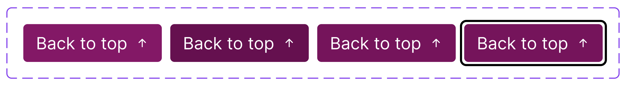
Back to top accessibility
The “back to top” button on the footer of the page now includes the words “Back to top” and no longer solely relies on an arrow. This label will make the element more accessible.
Keyboard accessibility
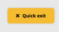
The quick exit feature allows users to exit a site quickly. We have created a special region for this element so that it appears near the top of the links for keyboard users. This makes it easier for keyboard users to exit, avoiding the need to tab through many less important links.
Components
A starter site such as Convivial for GoVCMS needs to walk the fine line between offering helpful features and avoiding bloat. New features are added after careful consideration of defined user needs.
Gallery component
A new gallery paragraph component has been added. It shows images and videos in an attractive lightbox. Transcripts and labels can also be included.
Lightbox component
Similarly, a lightbox component allows individual images to be opened in a lightbox. This is helpful where a specific image, such as a product, may need special treatment.
Model Viewer media
Recently, a client needed to showcase content in the form of 3D models. We made use of the “Model Viewer” project to display the interactive 3D renderings. We implemented this as a new media bundle so that it can be easily included in WYSIWYG and in fields.
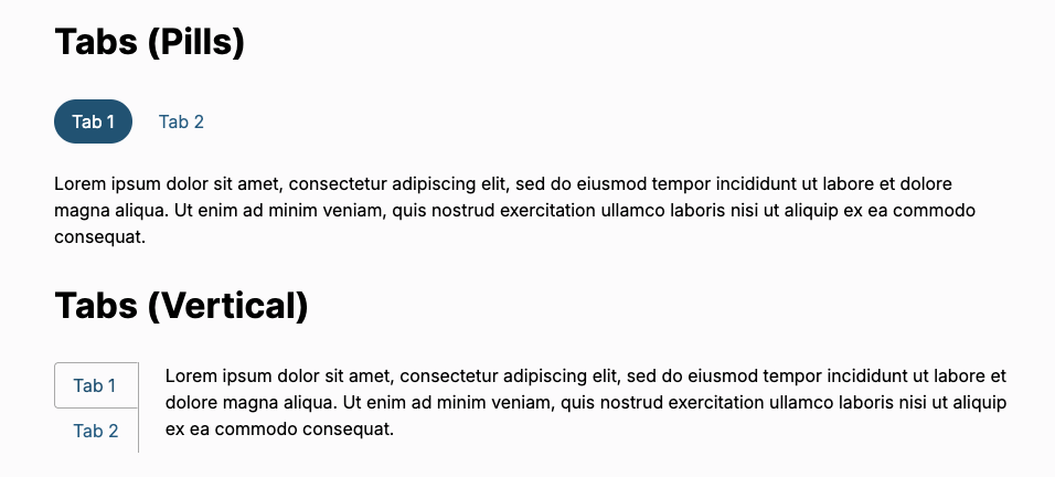
Better content tabs
Convivial for GovCMS has long support content in a tabbed format. Originally, we kept this simple and only allowed textual content in a set format. In a recent project, the tabs needed to be more flexible. They now support:
- Tabs and Pills
- Horizontal and Vertical layout
- Rich components for content.
Features
Information icons feature
Information privacy icons are now included in the footer of the page. This conforms with best practices for government sites where users need quick and consistent links to key privacy documents.

Quick exit feature
Several recent clients required a quick exit feature, allowing users to exit the site with a click of a button. We have therefore implemented this as a simple component that can be easily configured to go to a particular URL.
External links
Sites need to manage external links in different ways. It is common to display a small icon next to the link. Sometimes the link needs to open in a new tab (even though this is very much against accessibility recommendations). And in rare cases, a modal needs to be shown if the user is exiting the site to an unvetted domain. To handle these use cases, the theme makes these options easily configurable.
Privacy control centre
We have improved the way we handle privacy on the site, allowing users to opt in or out of various tools, including analytics, content recommendations, and content personalisation. This puts power into the user's hands, giving them the ability to stop tracking on the site.
Design
Convivial for GovCMS has purposely taken a very “vanilla” approach to the look and feel, making no firm commitment to a design. We have relied on the default theming provided by Bootstrap 5. This approach was taken to keep the theme flexible for clients wanting their own look and feel. Notwithstanding the benefits of a non-opinionated theme, there were some areas which needed improvement.
Transition effects
By default, we have turned on UI interactions in Bootstrap, providing a bit more feedback for users. We have also added transitions to the search box and the megamenu for a better feel.
Better displays
Our displays have received some small improvements
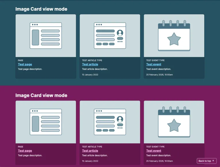
- Cards are colour palette aware - adapting to dark palettes. This is a big win.
- Big teasers work better on bigger screens - making them easier to read.
- Typography weights, line heights and letter spacings are more refined - headings are more impactful.
Breadcrumb design
Breadcrumbs now use carets rather than a slash. This is more expected.

Sidebar menu design
The sidebar menu has been improved with a more structured look. There is a much clearer delineation of the dropdown arrow and the menu item link. This should make the menu much more usable.
Megamenu design
The megamenu has been improved. It is now colour palette aware. It also has had the vertical line removed, allowing the menu items to be more easily understood as going from left to right.
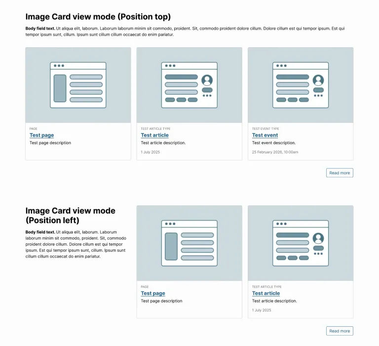
Component header position
Most of our components support a “heading” and “intro” before the content for the component is shown. This header information can now be displayed in three configurations: top and side options. This makes it much easier to build out attractive layouts just through a configuration option. Previously, users would need to build out a section to get the heading and it on the left-hand side. Now it is much simpler.
Better responsiveness for lists
Our strategy for responsiveness of lists (cards, teasers) in various layouts (halves, thirds, quarters) was based on a media query targeting the device width. This strategy worked so long as the width of the container could be assumed to be wide enough. eg 800px. However, more demanding layouts will have lists being displayed in narrower spaces. We have therefore reworked our responsive rules to be based on the width of the container, rather than the window.
Header design
The logo area of the page layout is now more compact. This is in line with modern trends and doesn’t feel as naive as designs with larger logos. This has the end result of improving signal to noise, whilst keeping the logo prominently displayed.
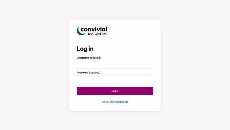
Login design
We were inspired by the Gin Login module and decided to make the login page look a little more attractive. You would know you are logging into a Drupal site.
Typeface design
We were inspired by the typography of the new http://digital.gov.au/ site, which uses the “Inter” typeface. It is hard to believe that the Australian government doesn’t have a recommended font for government sites. In the lack of such guidance, it made sense to settle on Inter as it is being used by the DTA on its own site. During this process, we made use of TypeScale, a helpful site for quickly road-testing typography design options.
Conclusion
The latest batch of changes to Convivial for GovCMS really brings the offering up a notch or two. The platform is no longer just a vanilla starting point for site owners wishing to enjoy best practices for site building, editor experience and accessibility. The latest changes are focused on improving the look and feel of the site, the use of colour and improving the user experience.
We encourage you to try the new changes out on the Convivial for GovCMS demo site. If you are a government agency and interested in taking the platform for a spin, please contact us. We are happy to build out a demonstration site for you, showcasing the features most relevant to your needs.